Supervision Dashboards

Clicking the supervision icon in the left navigation bar will take you to the supervision dashboard. This dashboard is only accessible to Bells Administrators or Supervisors. This dashboard view will vary if you're an administrator or a supervisor. If you're an administrator, you will have access to both dashboards. If you're a supervisor that is not an administrator, you will not see the pill-toggle at the top to separate the dashboards.
Bells Administrators
If you're a Bells Administrator, you will see the display is tabbed out for Program and Individuals as well as filters along the top, metrics, Top Performers, Late Signers, a Session Status graph, an Active vs Enabled Users graph, Mobile Adoption, Notes from an appointment graph (if applicable), and a Notes heatmap graph.


Bells Administrators have access to both versions of the Supervision Dashboard: Programs and Individuals.
The Program dashboard shows data based on all programs or selected programs in the filters at the top.
The Individual dashboard shows a supervisors' supervisees or as an admin can be changed to any individual/multiple Bells users.
Filters
At the top left of the dashboard are the filter options.

The date timeframe allows up to one year to be selected to view. You can choose a relative date like Today, Last 30 Days, Last 6 Months etc. or you can choose to select a custom date range. Regardless of which selection you use, only a maximum of one year can be selected.
The Program, Location and Service filters allow you to narrow the widget results to specific Programs, Locations and/or Services.
Metrics
The metrics widget of the Supervision Dashboard shows the following data based on the filter criteria at the top of the dashboard.

Signed Notes is the total number of signed notes for the selected time period.
- This count does not include imported notes from the EHR.
Unsigned Notes is the total number of unsigned notes. This metric does not utilize the filters at the top of the dashboard.
Late Notes is the percentage of notes that have exceeded the session to sign hour threshold for the selected time period.
Session to Sign shows the average session to sign metric for the organization.
Accepted Recommendations is the percentage of accepted recommendations for the users in the selected time period.
Accepted Spelling and Grammar is the percentage of accepted spelling/grammar corrections for the users in the selected time period.
Each metric shows the percentage change from the previous period based on the selected timeframe in the filters. This is visible to the right of the label in green for positive change or red for negative change.
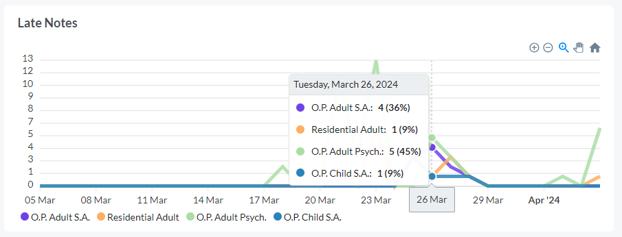
Top Performers and Late Signers
The Top Performers and Late Signers widgets show the top and the lowest users for the organization based on the filter criteria with regard to their percentage of Late Notes.
Top Performers widget tells you which users have the smallest percentage of their notes that are late.
The Late Signers widget tells you which users have the most late notes and the percentage of their notes that are late.
You can sort the widget by Total Notes or Late Note and click the View Data button in the top right of each widget to see all users' late note percentage for the criteria.
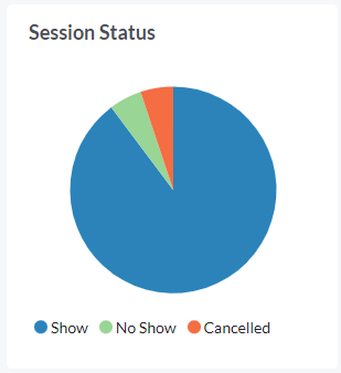
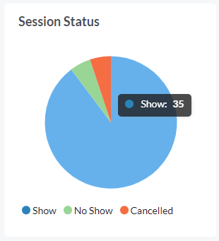
Session Status
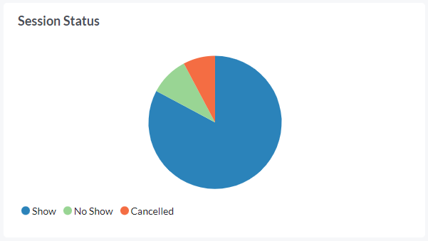
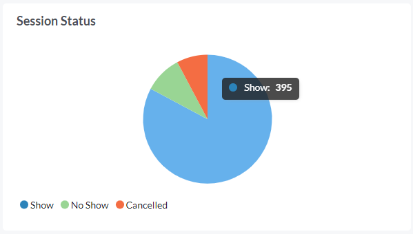
The session status widget shows the breakdown of signed notes per status based on the filter criteria.
On hover, the tooltip shows the number of notes for each status.
Active vs Enabled Users


The Active vs Enabled Users widget shows the percentage of Active users relative to the Enabled users. Active users are users that have logged into Bells in the last 30 days. Enabled users are all users who are enabled in Bells, regardless of whether they have signed in. This widget does not take the filter criteria into account.
On hover, you see the number of active users and number of enabled users for the organization.
Mobile Adoption
The Mobile Adoption widget shows the breakdown of users who have signed into Bells for Web only or Mobile users.

Users that show for “Web” only logged into the web application and had no logins to the mobile application within the Dashboard timeframe.
Users that show for Mobile logged into mobile applications within the Dashboard timeframe.
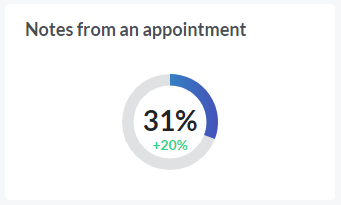
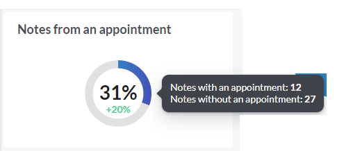
Notes from an appointment
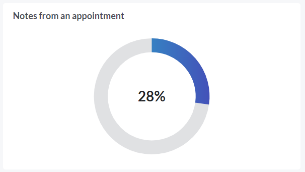
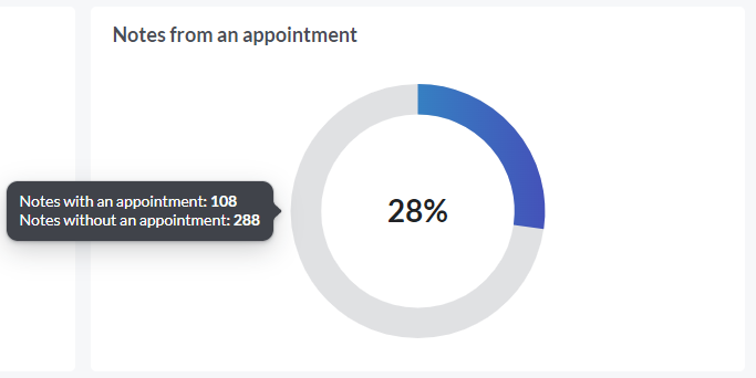
The Notes from an appointment widget shows the percentage of notes that originated from an appointment in the agenda. If your organization doesn't use the agenda/scheduler, you will not see this widget.
On hover, you will see the breakdown of notes with and without appointments for the selected filter criteria.
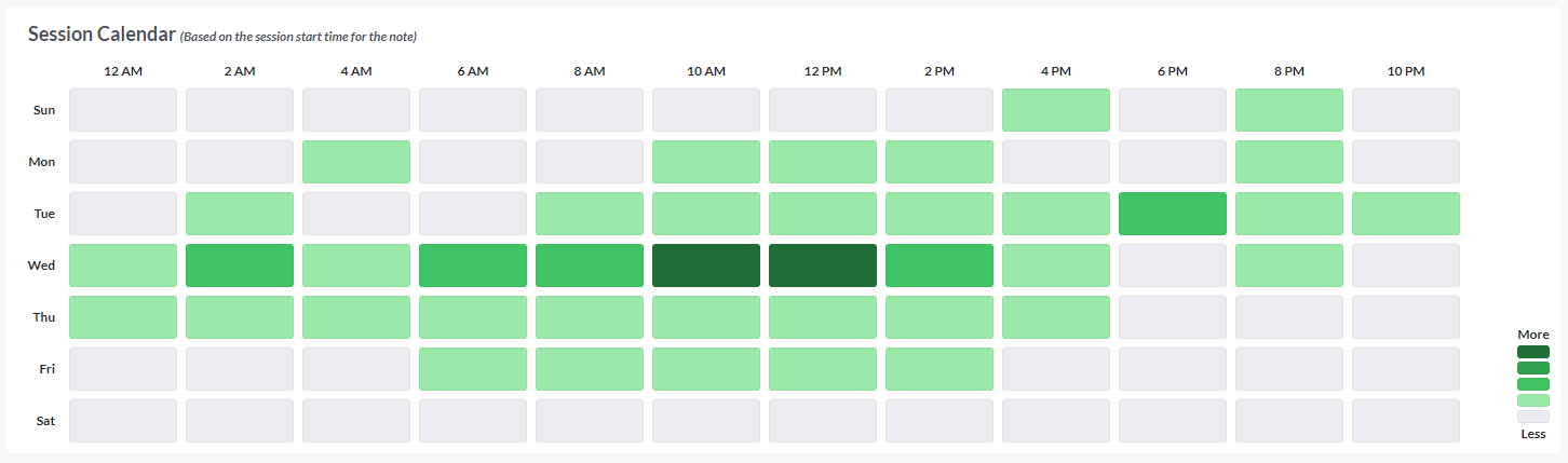
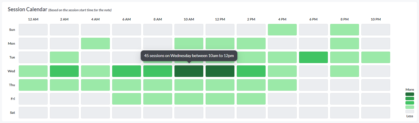
Session Calendar

The Session Calendar heat map at the bottom of the display shows you which days in the last week have the most sessions.
There is one square per day of the week per timeframe.
On hover, you see the number of sessions for the day and timeframe.
The data in this graph is based on the filter criteria and is based on the session start time for the note.
Notes will only show in this widget if they include a session time section.
Supervisors
If you're a Bells Supervisor, you see filters along the top, plus note metrics, a Session Status graph, a graph of Active vs Enabled Users or Notes from an appointment, a Signed vs Late graph, a User Distribution graph, a Distribution of Services graph, a Service Location graph, and a Session Calendar graph.
If you're a Bells supervisor, this dashboard shows your supervisees.
If you're a Bells administrator, you can change the staff list to show individual and/or multiple Bells users.


Filters
At the top left of the dashboard are filter options.

The date timeframe allows up to one year to be selected to view. You can choose a relative date like Today, Last 30 Days, Last 6 Months etc. or you can choose to select a custom date range. Regardless of which selection you use, only a maximum of one year can be selected.
The staff filter defaults supervisees of the user who is signed in. Non-administrator supervisors will not be allowed to change the staff in the filter beyond themselves and their supervisees. Administrator users can change the staff selection to any staff in the organization.
The program, location and service filters allow you to filter to a specific programs, locations or services based on the notes in the timeframe for the Staff selected.
Metrics
The metrics widget of the Supervision Dashboard shows the following data based on the filter criteria at the top of the dashboard.

Signed Notes is the total number of signed notes for the selected time period.
Unsigned Notes is the total number of unsigned notes. This metric does not utilize the filters at the top of the dashboard.
Session to Sign is the average session to sign of the notes based on the filters.
Acceptance Recommendations is the percentage of recommendations that were accepted based on the filter.
Each metric shows the percentage change from the previous period based on the selected timeframe in the filters. This is visible to the right of the label in green for positive change or red for negative change.
Session Status
The session status widget shows the percentage of signed notes per status based on the filter criteria.
On hover, the tooltip shows the number of notes for each status.
Signed vs Late
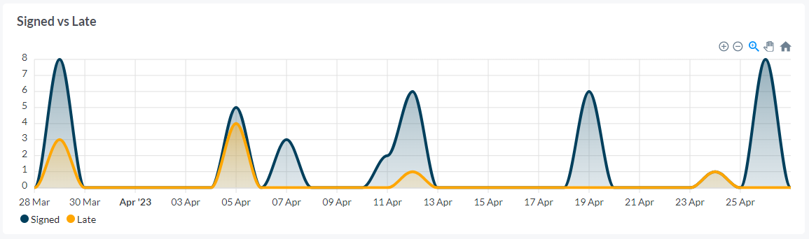
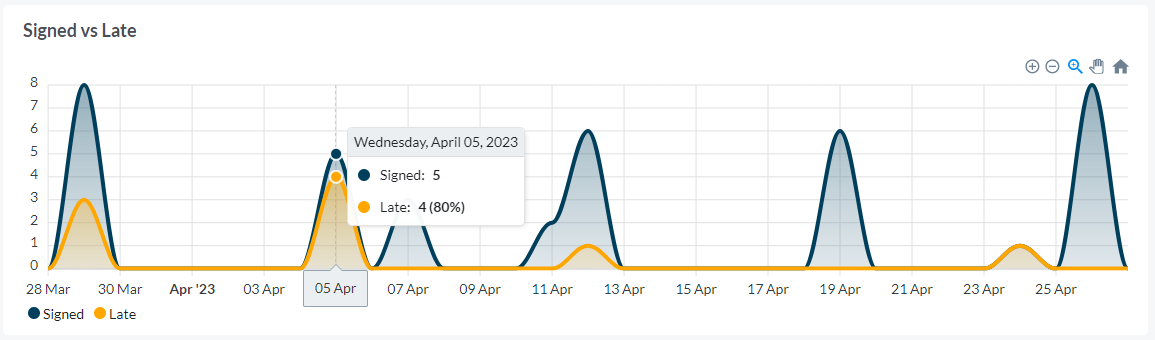
The Signed vs Late graph is a stacked area graph that shows the number of Late notes compared to the number of signed notes based on the search criteria.
On hover, you see the number and percentage of late notes relative to signed notes for a specific day.
Top Performers and Late Signers
The Top Performers and Late Signers widgets show the top and the lowest users for the organization based on the filter criteria with regard to their percentage of Late Notes.
Top Performers widget tells you which users have the smallest percentage of their notes that are late.
The Late Signers widget tells you which users have the most late notes and the percentage of their notes that are late.
You can click the View Data button in the top right of each widget to see all users' late note percentage for the criteria.
User Distribution
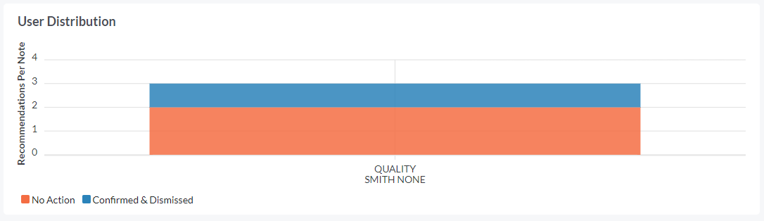
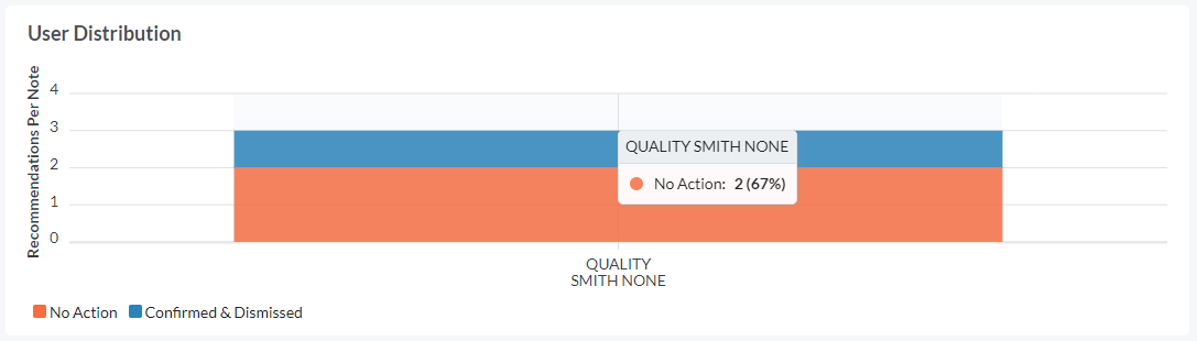
This User Distribution graph shows the number of recommendations that had no action taken vs. confirmed/dismissed per note. This column graph shows data based on the filter criteria. Only staff that have taken no action for 5 or more recommendations in the time period will be included in the graph.
On hover of each action type (No Action or Confirmed & Dismissed), you can see how many recommendations resulted in each action type.
Distribution of Services
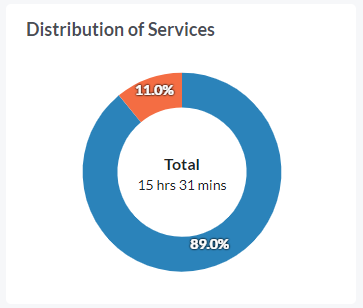
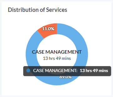
The Distribution of Services widget shows the percentage and total time of services provided based on the filter criteria. This is based on Signed Notes only.
On hover, each service shows total session time for the signed notes for the service, based on the filter criteria.
Notes will only show in this widget if they include a session time section.
Service Location
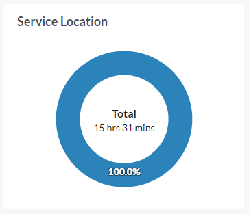
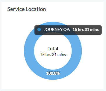
The Service Location widget shows the percentage and total time of service locations based on the filter criteria for Signed Notes only.
On hover, each service location shows total session time for the signed notes for the service location, based on the filter criteria.
Notes will only show in this widget if they include a session time section.
Session Calendar
The Session Calendar heat map at the bottom of the display shows you which days in the last week have the most sessions.
There is one square per day of the week per timeframe.
On hover, you see the number of sessions for the day and timeframe.
The data in this graph is based on the filter criteria and is based on the session start time for the note.
Notes will only show in this widget if they include a session time section.
Notes from an appointment
Which widget you see depends on whether your organization utilizes the agenda or not.
If your organization utilizes the agenda, the Notes from an appointment widget will show. This widget shows the percentage of notes that originated from an appointment in the agenda. If your organization doesn't use the agenda/scheduler then you will not see this widget.
On hover you will see the breakdown of notes with and without appointments for the selected filter criteria.
If your organization doesn't utilize the agenda, the Active vs Enabled widget will show. The Active vs Enabled Users widget shows the percentage of Active users relative to the Enabled users. Active users are users that have logged into Bells in the last 30 days. Enabled users are all users who are enabled in Bells, regardless of whether they have signed in. This widget does not take the filter criteria into account.
On hover, you see the number of active users and number of enabled users for the organization.
Compare View
The Compare view is a new way to view data metrics in Bells. This view allows administrators and supervisors in Bells to compare up to 5 programs or users across 10 different metrics. In this view you also get to customize what metrics/widgets show and where they show in the display.
In the top right corner of the Administrator (Program) and Supervisor (Individuals) dashboards is a button to toggle to the Compare view.
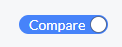
The compare view toggle will be disabled if there is too few or too many programs or users selected to compare. The compare view will only display is there is 1 to 5 programs or users to compare.


Once toggled/in compare view, you will see another button for Customize.
Clicking Customize opens the Compare view display into an edit mode. In edit mode you can add, move or remove widgets from the display.
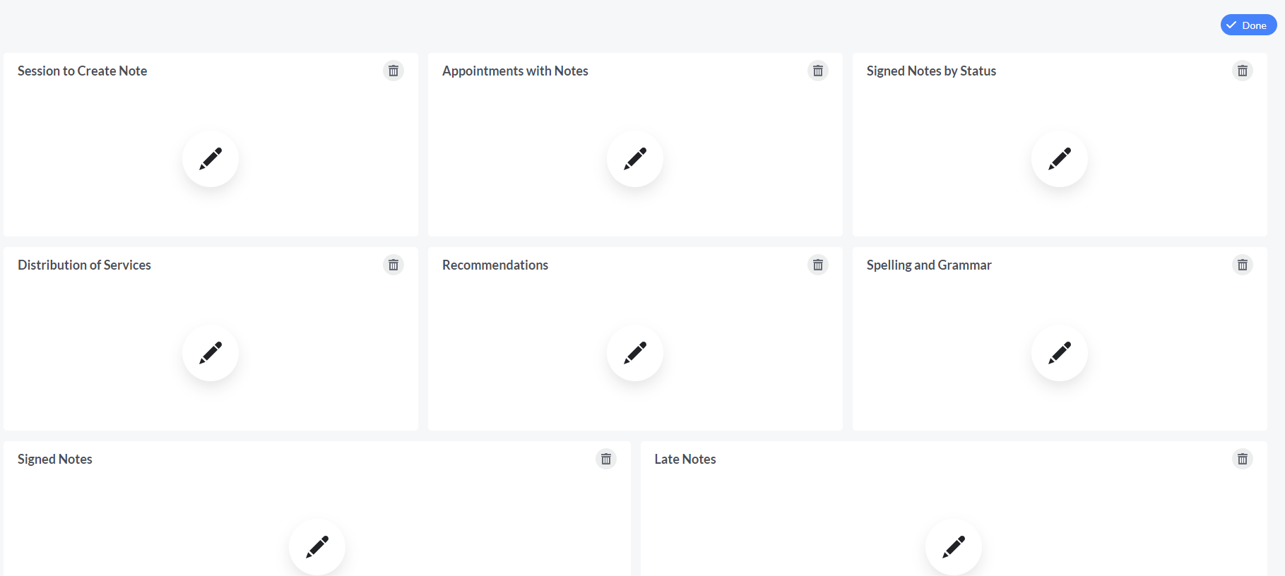
Clicking the edit icon in a widget opens the Widgets display to select what widget to put in place of where you clicked the edit icon.
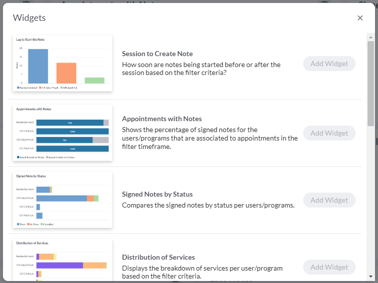
Widgets
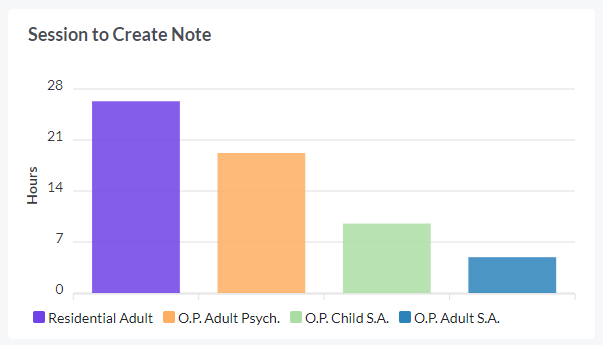
Session to Create Note compares the time from the note being started to the session time based on the filter criteria.
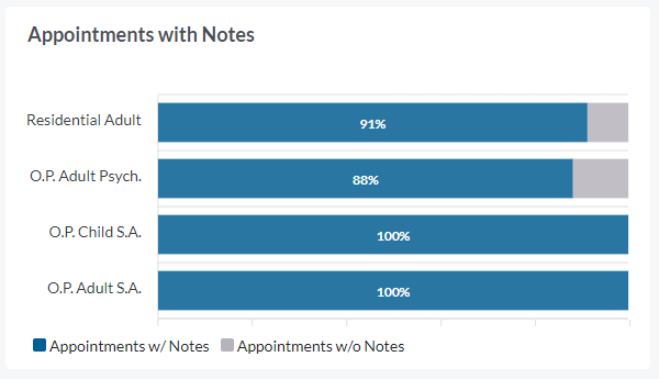
Appointments with Notes shows the percentage of notes associated to an appointment.
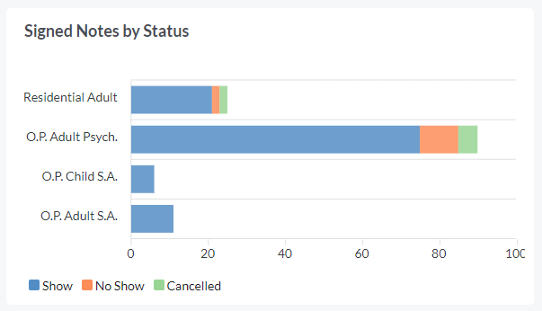
Signed Notes by Status displays the breakdown of the signed notes show status in the filter timeframe.
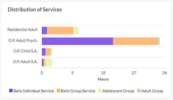
Distribution of Services shows what services are being provided based on the filter criteria.
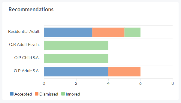
Recommendations compares the recommendations that were accepted, dismissed or ignored.
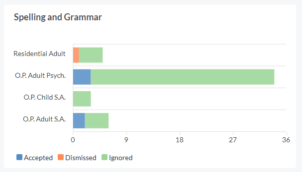
Spelling and Grammar compares the spelling corrections that were accepted, dismissed or ignored.
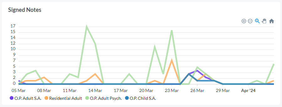
Signed Notes displays the signed notes based on the filter criteria.
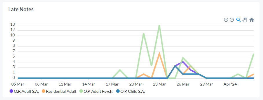
Late Notes displays the late notes based on the filter criteria.
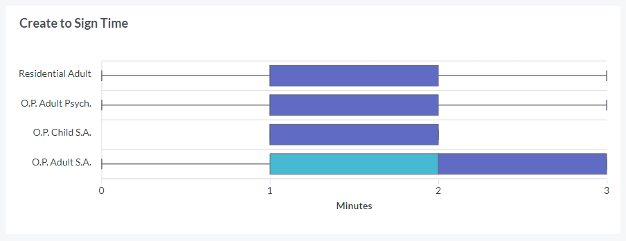
Create to Sign Time compares the create to sign time for the programs/users selected in the timeframe of the filters.
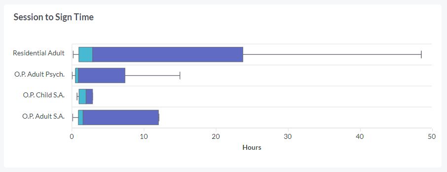
Session to Sign Time compares the session to sign time for the programs/users selected in the timeframe of the filters.
Hovering on a metric in a widget, shows a breakdown of the data provided based on where you're hovering in the widget.